
Creating a Calm Bedroom with Soft Natural Colours
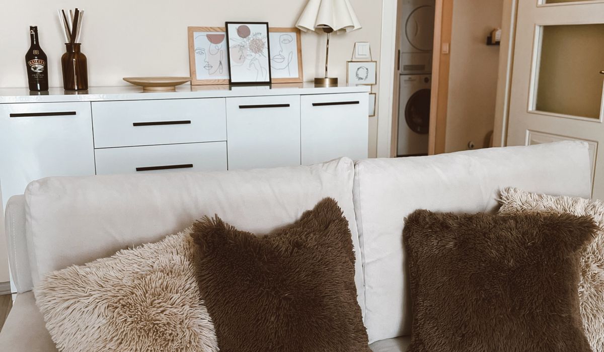
Why Soft Natural Colours Settle a Room
A bedroom has one straightforward job: to help you switch off. Bold pattern and saturated colour are wonderful in a hallway or a dining room, where a bit of energy is welcome, but in the room where you sleep they keep the eye working long after you would like it to stop. Soft natural colours do the opposite. They blur the edges of a space, absorb light gently and make a room feel slightly larger and considerably quieter.
The trick is restraint. Rather than collecting every shade you like, aim for three tones working together: a base, a mid-tone and an accent. A warm white on the walls, a gentle green or muted pink in the textiles, and a deeper version of one of those colours on a headboard, a lampshade or a cushion. When everything sits within a narrow band of tone, the eye has nothing to snag on.
Begin with a Warm White Base
Brilliant white is crisp and clean, but it can read cold in a bedroom, especially in a north-facing room where daylight arrives flat and blue. Warm whites — chalk white, almond, soft linen, off-white with a whisper of yellow or grey — hold the light better and flatter both skin tones and natural fabrics.
Before you commit, paint a large sample patch on two walls and live with it for a few days. Colours look markedly different in morning, afternoon and lamp light, and a shade that is perfect at noon can turn slightly green by evening. For walls, a matt emulsion is the right choice: it softens shadows and hides the small imperfections that a sheen will exaggerate. Keep gloss for woodwork, and even there choose satin or eggshell rather than anything high-shine.
If you rent, or simply dislike painting, the same effect can be built from bedding, curtains and a large rug. Start with the largest surfaces first and work inwards.
Introducing Gentle Greens
Green is the most restful colour family in nature, which is exactly why it works so well here. Think sage, eucalyptus, soft olive and pale grey-green — shades with grey mixed through them rather than zingy, saturated leaf greens.
If you want to make a statement without repainting the whole room, paint a single wall behind the bed in a muted green and leave the rest warm white. The colour anchors the bed and gives the room a focal point, while the surrounding walls keep it feeling bright. Prefer not to paint at all? Bring green in through a linen duvet cover, a folded throw or a pair of curtains, which will move with you if you change your mind.
Green sits particularly well with pale wood, aged brass and cream ceramics. Avoid pairing a soft sage with a strong cool grey, which can tip it towards something clinical.
Muted Pinks and Blush Tones
Pink has a reputation problem, but dusty rose, clay, blush and soft plaster pink behave quite differently from the sugary shades people tend to picture. They carry warmth without brightness, which makes them ideal for bedrooms that face north or feel chilly in winter.
Use pink as the mid-tone rather than the base: a washed linen duvet cover, a wool blanket at the foot of the bed, a pair of cushions. It is especially good with warm white and gentle green, and it works beautifully alongside natural materials — oak, rattan, unglazed terracotta. For a slightly deeper, more grown-up version, look at shades sitting closer to clay or pale brown than to bubblegum.
One caution: pale pink next to cool grey drains both colours. Warm the grey up, or leave it out entirely.
Layer Texture, Not Pattern
Colour alone will not make a room feel calm; texture does much of the work. Where you might reach for a print or a graphic motif, reach instead for something you want to touch.
- Bedding: washed linen or brushed cotton in a shade drawn from your palette — keep the duvet plain and let texture carry the interest.
- Throws: a chunky wool or cotton knit, folded rather than spread flat, at the end of the bed.
- Floor: a jute or wool rug in a natural tone, softening bare boards and adding quiet warmth underfoot.
- Furniture: pale oak, ash or painted timber with a chalky finish rather than anything glossy.
- Finishing touches: a ceramic lamp base, a woven basket, a stoneware vase.
Matte finishes nearly always read calmer than shiny ones. If a surface reflects hard light, it will make the room feel busier, however gentle the colour beneath it.
Lighting and the Finishing Touches
Soft colour needs soft light to look its best. Choose warm white bulbs — around 2700K — and fit a dimmer switch wherever you can, so the room can wind down gradually through the evening.
Aim for at least three light sources: a ceiling fitting for practicality, plus two bedside lamps with fabric shades that diffuse the glow rather than casting it sharply. Fabric shades prevent the harsh pools of light that bare bulbs create. Add a small lamp on a chest of drawers if space allows, and use that instead of the ceiling light after dinner.
Keep surfaces deliberately sparse. A single stem in a vase, a book, a small dish for jewellery — one or two objects per surface is plenty. Curtains should be generous enough to fall in soft folds; a lined linen or cotton pair in a shade close to the walls will make the room feel taller and calmer than a sharp contrast at the window.
Finally, treat the palette as something to maintain. Every new cushion or picture is a decision about tone. When in doubt, choose the quieter option — in a bedroom, that is almost always the right one.


Layering bedding adds warmth and visual interest to a bed. This guide explains how to combine sheets, throws and cushions for a comfortable finish.
Small Victorian terraces often have compact rooms with plenty of charm. Discover layout, storage and decorating ideas that make every square metre count.
Compact hallways can become practical and welcoming with slim furniture and clever storage. These ideas help you maximise space without blocking movement.
Mirrors can make a small room feel brighter and larger when positioned thoughtfully. Learn where to place them for the best light and layout.