
Pairing Soft Neutrals with Deep Accent Colours
Why soft neutrals and deep accents belong together
Soft neutrals — think warm oatmeal, chalky off-white, mushroom and pale clay — create a calm, spacious backdrop. Deep accent colours — forest green, ink blue, aubergine, burgundy or charcoal — bring focus, warmth and a sense of occasion. On their own, a room full of neutrals can feel a little flat, especially in the UK where grey light often drains the life out of pale schemes. Add a deep accent and the neutral instantly looks richer, while the accent feels less overwhelming. The trick is to treat your neutral as the canvas and your deep colour as the art.
Getting the proportions right
A simple rule of thumb is 70 per cent neutral, 20 per cent secondary mid-tone, and 10 per cent deep accent. In practice, this means walls, floors and large furniture in your soft neutral, then a deep accent in a smaller but meaningful dose. You might use it on a single armchair, a headboard, a hallway door, or a run of kitchen cabinetry.
- 70 per cent neutral: walls, ceiling, flooring, sofa, curtains — the quiet majority.
- 20 per cent mid-tone: wood tones, linen lampshades, a jute rug, a soft grey throw — bridging shades.
- 10 per cent deep accent: cushions, a painted alcove, a velvet footstool, artwork — the punctuation.
You can push the accent to 20 per cent in a room that gets lots of natural light, but in a north-facing or compact room, keep it closer to 10 per cent and repeat it in two or three places so it feels intentional rather than random.
Living rooms: depth without the gloom
A living room is where this pairing shines. Try a base of soft greige or warm chalk on the walls, then bring in a deep teal sofa or a pair of navy armchairs. If you prefer a lighter sofa, paint a deep forest green alcove or chimney breast. A burgundy velvet cushion on an oatmeal sofa, plus a matching throw, will tie the scheme together. For a traditional terrace, deep charcoal on a sash window frame against pale plaster walls looks crisp and considered. For a modern flat, an aubergine accent wall behind a media unit adds warmth without darkening the whole space.
Bedrooms: calm base, confident accent
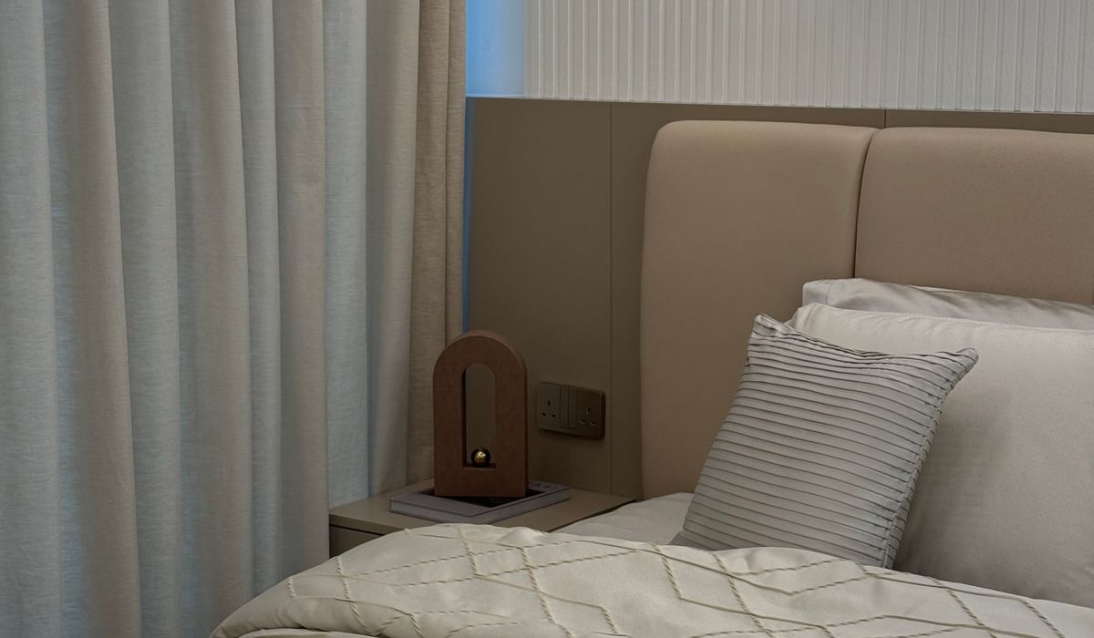
Bedrooms benefit from a restful neutral base — soft linen, warm white or pale taupe on the walls. Then choose one deep accent to anchor the room. A deep ink blue upholstered headboard against off-white walls is a classic combination that feels hotel-like but homely. Alternatively, use a deep green or plum on a single wall behind the bed, keeping the other three walls neutral. Bedding is an easy place to experiment: deep rust or charcoal pillows on a cream duvet, with a soft neutral throw folded at the end. Keep the accent to the bed area so the room still feels restful.
Hallways and small rooms: turning tight spaces into a feature
Hallways are often short on light, which makes them perfect for a deep accent — used with care. Paint the walls in a soft neutral and then take the front door or an internal door to the ceiling in a deep colour. A deep green or navy on a hallway door creates a strong focal point and hides scuffs better than pale paint. For a narrow corridor, paint the far wall in a deep shade to make the space feel like it has a destination, and keep side walls light. In a small cloakroom, you can be bolder: a deep accent on all walls with a neutral ceiling and white sanitaryware feels jewel-box smart rather than oppressive.
Choosing your specific shades
Not all neutrals are equal. Warm neutrals — oatmeal, biscuit, mushroom — pair beautifully with deep greens, rust and brown-based burgundy. Cool neutrals — pale grey, chalky white, soft blue-grey — sit well with navy, charcoal, deep teal and blackened blue. Always test paint in the actual room, on at least two walls, because UK light changes dramatically between north and south aspects. Paint large patches and live with them for a few days. If a deep accent feels too heavy, choose a version with more grey or brown in it rather than a pure saturated hue. And remember that artificial light will warm colours up, while daylight will cool them down. A final check: hold your chosen fabric or paint chip next to your neutral at different times of day. If the neutral looks richer and the accent looks calmer, you have found your pairing.


Utility rooms can become chaotic without a clear system. Use labelled baskets, drying racks and vertical shelving to keep laundry and cleaning items organised.
Alcoves and corners offer useful storage without taking up floor space. Learn how to plan bespoke shelving that fits irregular walls and period details.
Warm lighting helps a living room feel inviting after dark. Choose bulbs, lampshades and dimmers that create a soft glow without harsh glare.
Open plan spaces need flexible lighting for different tasks and moods. Discover how to combine ceiling, task and accent lights across one large room.